Thanks for using UD Image Sign & Watermark. It lets you add branded image and text watermarks to photos directly in your browser.
The app runs entirely client-side—no uploads, no servers—so your images and watermarks stay private.
You can apply presets, drag positions manually, adjust size, opacity, rotation, and save results individually or in bulk.
This is something that I put together for my own use, and since I primarily use a PC, it tends to be PC-centric. But except for not being able to drag watermarks, it should work just fine on your mobile devices.
I think these instructions say it all, but let me know if something doesn't make sense, or doesn't work, or looks like crap.
Thanks, Uncle Dave
Contact me at the place formerly known as Twitter: @deebeeeff if you have any questions or find any bugs. (Spoiler alert: There are some!)
Overview: The Two Watermark Layers
UD Image Sign & Watermark supports two independent watermark layers per image:
Text Badge — Your text, styled with font, color, background, shadow, and shape controls.
Image Badge — A logo or graphic image watermark.
Both layers are controlled globally—settings you change apply to all currently loaded images at once. The only thing that is per-image is where you have manually dragged a watermark.
Each layer has its own section of controls (Text Badge Settings and Image Badge Settings), and each can be toggled on or off independently. Both sections can be expanded or collapsed with their Hide This Section / Show This Section buttons—hiding a section does not turn it off.
The Floating Controls Panel
On larger screens (primarily desktop/laptop) you will see a draggable floating panel in the upper-left corner of the screen. It mirrors most of the fixed controls for whichever section you have selected.
The floating panel has two modes: Floating Text Settings and Floating Image Settings. Switch between them using the Switch to Image Settings / Switch to Text Settings button at the top of the panel.
The floating panel can be moved anywhere on the screen by clicking and dragging its title bar.
Use the Hide Me button to collapse the floating panel out of the way.
When the floating panel is hidden, a Show Floating Settings button will appear near the Upload/Paste buttons in the fixed controls area.
When you show the floating panel again, it returns to the same section it was in when you hid it.
The floating panel includes Upload Images and Paste Image buttons, so you can load images without scrolling to the bottom of the page.
The floating panel also includes the Save All Images, Save & Close All, Close All Images, Bridge controls, and Preset dropdown — so you can pretty much run the entire app from the floating panel alone.
The floating Text Settings mirror all fixed text controls except the text collection management buttons (Import/Export/Add/Delete/Remove All).
The floating Image Settings mirror all fixed image controls except the image collection management buttons (Import/Export/Upload/Remove All).
Both floating panels have checkboxes to toggle their respective watermark layer on and off. These checkboxes are synchronized with the fixed controls.
The floating panel also has a Position dropdown and the Tiled Watermark checkbox. These will only be active when images are loaded.
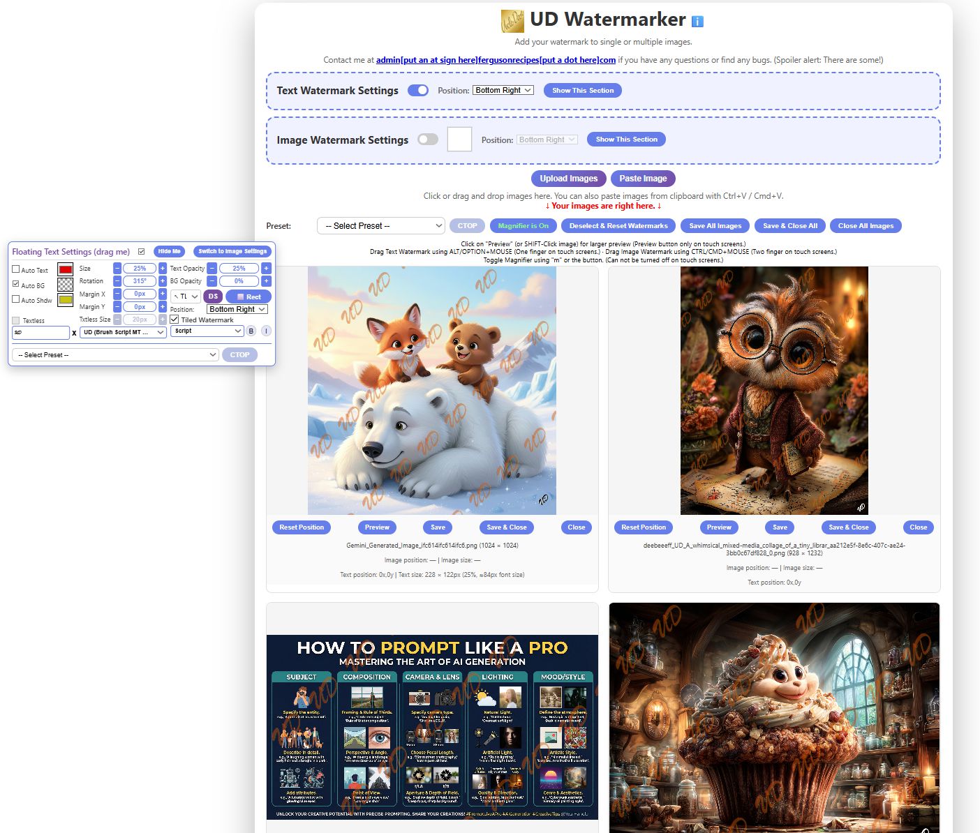
Text Badge Settings
Click image for full-size view
When you start UD Image Sign & Watermark for the first time, the Text Badge Settings will be enabled (toggle on). Turning it off will disable and grey out all text watermark controls.
The Hide This Section button collapses the text controls; a Show This Section button will appear in its place. Collapsing a section does not turn it off—all settings are preserved.
The Text Box and Text Styling
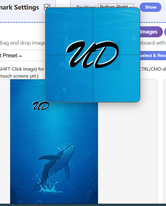
Enter your watermark text in the text input box. We will use "UD" as an example throughout.
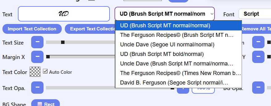
Next to the text box is a dropdown showing your saved text entries. When you select one, it loads that text, font, weight, and style into the controls.
The x button clears the text box. When the text box is empty, the Textless Badge controls become available (see below).
Choose a font from the font dropdown, and use the B (Bold) and I (Italic) buttons to style it.
DS toggles the drop shadow on and off. Drop shadow color and direction still work when DS is off; you just won't see the shadow.
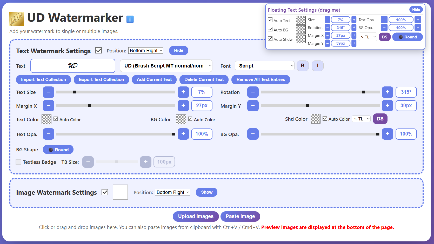
Managing Saved Text Entries
Add Current Text (*) — Adds the text currently in the text box (along with its font, weight, and style) to the dropdown. An asterisk (*) in the button indicates there is unsaved text. The dropdown shows the text and font info, for example: "UD (Brush Script MT normal/normal)".
Delete Current Text — Removes the currently selected text entry from the dropdown. This does not affect saved collections.
Remove All Text Entries — Clears all entries from the dropdown. Does not delete any saved collections.
Export Text Collection — Exports all current text entries to a .tudw file.
Import Text Collection — Imports a saved .tudw file. Duplicate entries (same text, font, weight, and style) are automatically skipped.
Click image for full-size view
Text Color, Background Color, and Drop Shadow
These settings are global and affect all watermarks in all currently loaded images.
Auto and Manual Modes
In the Text Badge Settings you will see three checkboxes labeled Auto Text, Auto BG, and Auto Shdw. Next to each label is a box that shows a checkerboard pattern in auto mode, or a solid color in manual mode.
Auto Mode Behavior
Auto Text: The text color (black or white) is chosen automatically based on sampling the image pixels beneath it.
Auto BG: The background color is sampled from the image pixels beneath the watermark.
Auto Shdw: The shadow color is automatically chosen to contrast with the text (white shadow for black text, black shadow for white text).
Important: When a text watermark is layered over an image watermark, the image watermark is treated as part of the image for color sampling purposes.
Manual Mode
Click the checkerboard box or uncheck the checkbox to enter manual mode for that color.
In manual mode, use the color picker or eyedropper to select a color for Text, BG, or Shdw.
Auto mode behaviors remain active for any color you haven't switched to manual. For example, a manually set white background with Text and Shdw in auto will still change text and shadow colors automatically.
Manually selected colors remain stored behind the checkerboard even when you switch back to auto mode.
Drop Shadow Direction
Next to the Shdw color box is a dropdown with eight direction options: ↖ TL, ↑ T, ↗ TR, → R, ↘ BR, ↓ B, ↙ BL, ← L.
Text Opacity (Text Opa.) and Background Opacity (BG Opa.)
Text Opacity controls the opacity of the text (and its shadow).
Background Opacity controls the opacity of the text background.
Use the slider, the +/− buttons, or type a number directly. Hold down a +/− button to increase or decrease continuously without repeated clicking.
Background Shape (BG Shape)
Toggles the text background between Rectangular and Round (pill/circle shape).
Due to some system limitations, the round background will not honor the upper and lower edges of the image.
Text Positioning, Size, and Rotation
Positioning Using the Position Dropdown
Choose from: Bottom Right, Bottom Left, Top Right, Top Left, or Center.
With the exception of Center, all positions respect the Margin X and Margin Y settings.
Margin settings are always measured from the nearest corner.
Click image for full-size view
Margin X and Margin Y
Fine-tune the position from the nearest corner.
Measured in pixels (px), from 0 to 100.
Use the slider, the +/− buttons, or type directly. Hold +/− to change continuously.
Text Size
Text size is calculated as a percentage of the width of each image, so the same percentage will produce different pixel sizes on different images.
Use the slider, +/− buttons, or type directly.
Rotation
Rotation is in degrees (°). Use the slider, +/− buttons, or type directly.
Rotated text can sometimes go partially off the edge; use margins or dragging to correct.
Notes
One quirk: if you previously set the dropdown to Top Right, for example, and then dragged the text manually, selecting Top Right again will do nothing. Either choose a different dropdown option and then return to Top Right, or click the Undo Drag button under the image first.
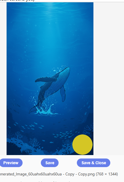
Textless Badge
When the text box is empty, the Textless Badge controls become enabled.
Checking the Textless Badge checkbox enables a badge that shows no text—only the background shape and color.
Use the Textless Size slider or +/− buttons to set the size of the textless badge.
The Textless Badge uses the BG color (auto or manual). In auto mode it samples the underlying image, so a Textless Badge on a white area will be white.
All text controls except Text Size, Text & Shadow Colors, and Text Opacity work on the Textless Badge.
🚨⚠️ If your Textless Badge isn't changing size, make sure you are using its own slider, not the Text Size slider.
🚨⚠️ If you can't see the Textless Badge: check that it isn't too small (4px is tiny), and check that you haven't left BG color in auto mode over a matching background.
Because there is no text, no position or size information will appear below the images.
Tiled Watermark
The Tiled Watermark checkbox (in the Text Badge Settings) tiles your text watermark across the entire image repeatedly.
All text controls work for Tiled Watermark except shadow direction, background color/opacity, and margins.
Tile spacing is based on font size and is not independently adjustable.
When you check Tiled Watermark, your current text settings are saved and restored when you uncheck it.
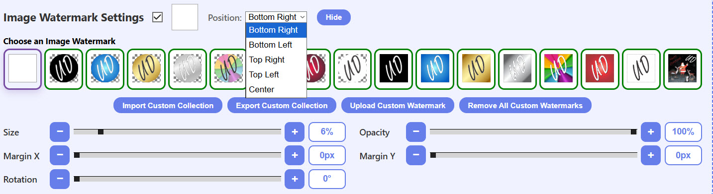
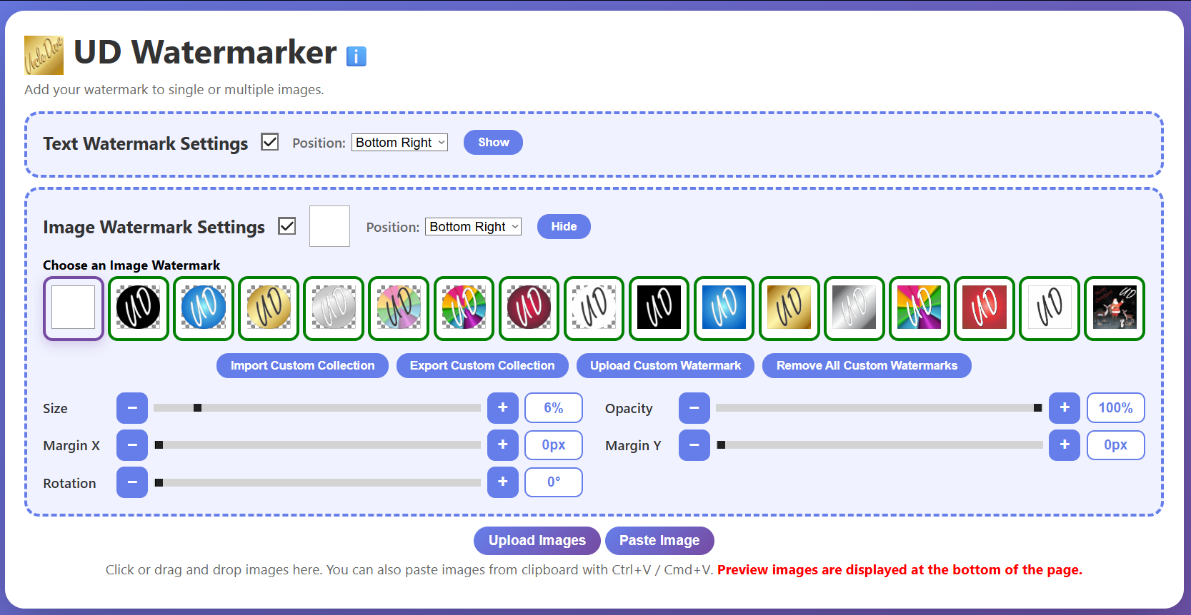
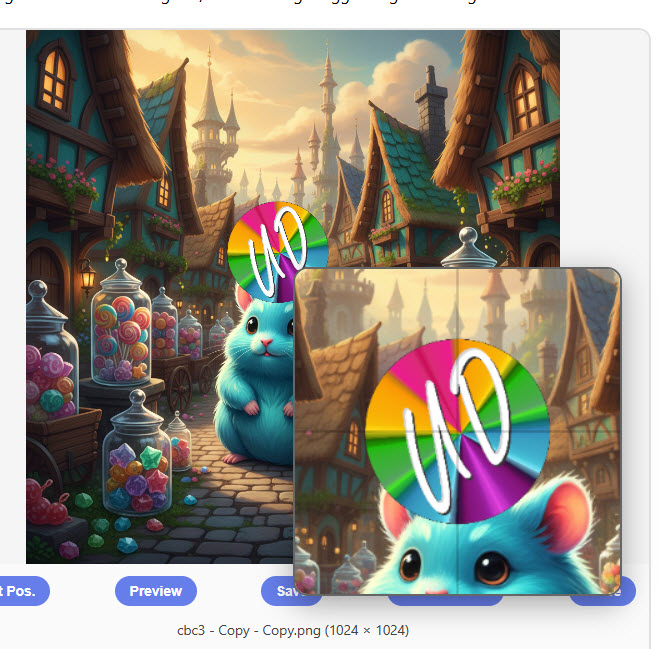
Image Badge Settings
With loaded image watermarks (left). Default single watermark (right). Click images for full-size view.
When you start the app for the first time, Image Badge Settings will be enabled. Turning it off disables and greys out all image watermark controls.
🚨 If the Image Badge Settings toggle is off and grayed out, click on any image watermark in the grid to turn it back on.
The Hide This Section button collapses the controls without turning them off.
The Image Watermark Grid
Getting Started
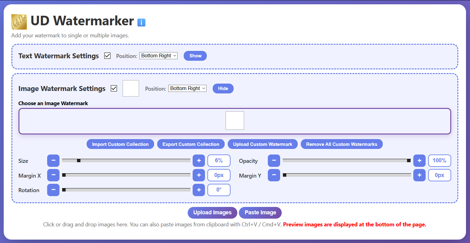
When you first start the app you will see a single white box in the grid. This white box is always present and cannot be removed.
If you start with https://fergusonrecipes.com/udwm/udwm.html?guest=1, you will also see some preset colored backgrounds in addition to the white box.
Leave off the ?guest=1 if you don't want to see them.
The white box and any preset watermarks cannot be saved or altered.
Adding Your Own Image Watermarks
Click the Upload Custom Badge button to add your own watermark images.
Just about any image file type works, but PNG or WEBP are best for transparency.
Files over 500KB will be rejected and a warning will appear.
Including the white default and any presets, the total number of image watermarks is 100.
Uploaded image watermarks have a green border in the grid. Hovering over them shows a preview and a red X button.
Clicking the red X deletes the watermark from the grid. If the watermark is part of a saved collection, it will remain in that collection.
Uploaded image watermarks persist between sessions until you delete them or clear your browser cache.
Exporting Custom Image Watermark Collections
Export Custom Collection saves all currently loaded custom watermarks to a .iudw file. Preset watermarks cannot be included in collections.
To create multiple different collections: upload only the watermarks you want in a given collection, export it, delete those watermarks, then upload a new set and export with a different name.
Importing Custom Image Watermark Collections
Import Custom Collection loads a saved .iudw file.
Unlike text collections, the app does not check for duplicate image watermarks—loading the same file multiple times will add duplicates.
Remove All Custom Badges
Removes all custom (uploaded and collection) watermarks from the grid. Preset watermarks are not removed. This does not delete them from any saved collections.
All settings here are global and affect all currently loaded images.
Hovering over an image watermark thumbnail (or long-press on mobile) shows a preview of that watermark.
Position Dropdown
Choose from: Bottom Right, Bottom Left, Top Right, Top Left, or Center.
All positions except Center respect the Margin X and Margin Y settings.
Margin X and Margin Y
Measured in pixels (px) from 0 to 100, always from the nearest corner.
Use the slider, +/− buttons, or type directly.
Size
Image watermark size is a percentage of the width of each image.
Use the slider, +/− buttons, or type directly.
Opacity
Use the slider, +/− buttons, or type directly.
Rotation
Rotation is in degrees (°). Use the slider, +/− buttons, or type directly.
Rotated image watermarks can sometimes go partially off-screen; use margin controls or dragging to correct placement.
Notes
One quirk: if you previously set the dropdown to Top Right, then dragged the image watermark manually, selecting Top Right again will do nothing. Choose a different dropdown option first, then return to Top Right—or click the Undo Drag button under the image.
When you select the 🔄 Reset button (discussed later), Image Badge Settings are turned off. To restart them, select any image watermark in the grid.
Presets
The preset system lets you save and reuse your watermark settings. The preset dropdown and management buttons appear below the fixed controls area once at least one image is loaded. The preset dropdown also appears at the bottom of the floating controls panel.
The Preset Dropdown
The dropdown contains both built-in presets and your user-defined presets.
Built-in presets are hardcoded and cannot be modified or deleted.
Greyed-out presets in the dropdown are unavailable because their corresponding layer (text or image) is currently turned off.
Preset Types
Text Only — Saves all text badge settings.
Image Only — Saves all image badge settings.
Both — Saves text and image settings together.
What Text Presets Save
Size, Rotation, Margins X & Y, Opacity, Position (corner), Color control states (auto or manual color), Badge shape (Round or Rectangle), Drop-shadow direction, Textless settings if textless is active.
What Image Presets Save
Size, Rotation, Margins X & Y, Opacity, Position (corner).
What Presets Do NOT Save
The actual text in the text box, font, or text styling. (These are saved separately with the text collection system.)
The actual image watermark selected.
Tiled Watermark settings.
Preset Management Buttons
Add Preset — Saves the current watermark settings as a new user preset. You will be prompted to choose whether to save Text Only, Image Only, or Both, and to give it a name.
Delete Preset — Removes the currently selected user preset. Built-in presets cannot be deleted.
Import Presets — Loads user presets from a .pudw file.
Export Presets — Saves all user presets to a .pudw file.
Clear All Presets — Removes all user presets. This does not delete any exported collection files.
User-defined presets persist between sessions until you clear the browser cache or remove them manually. You can back them up and share them with the Export/Import buttons.
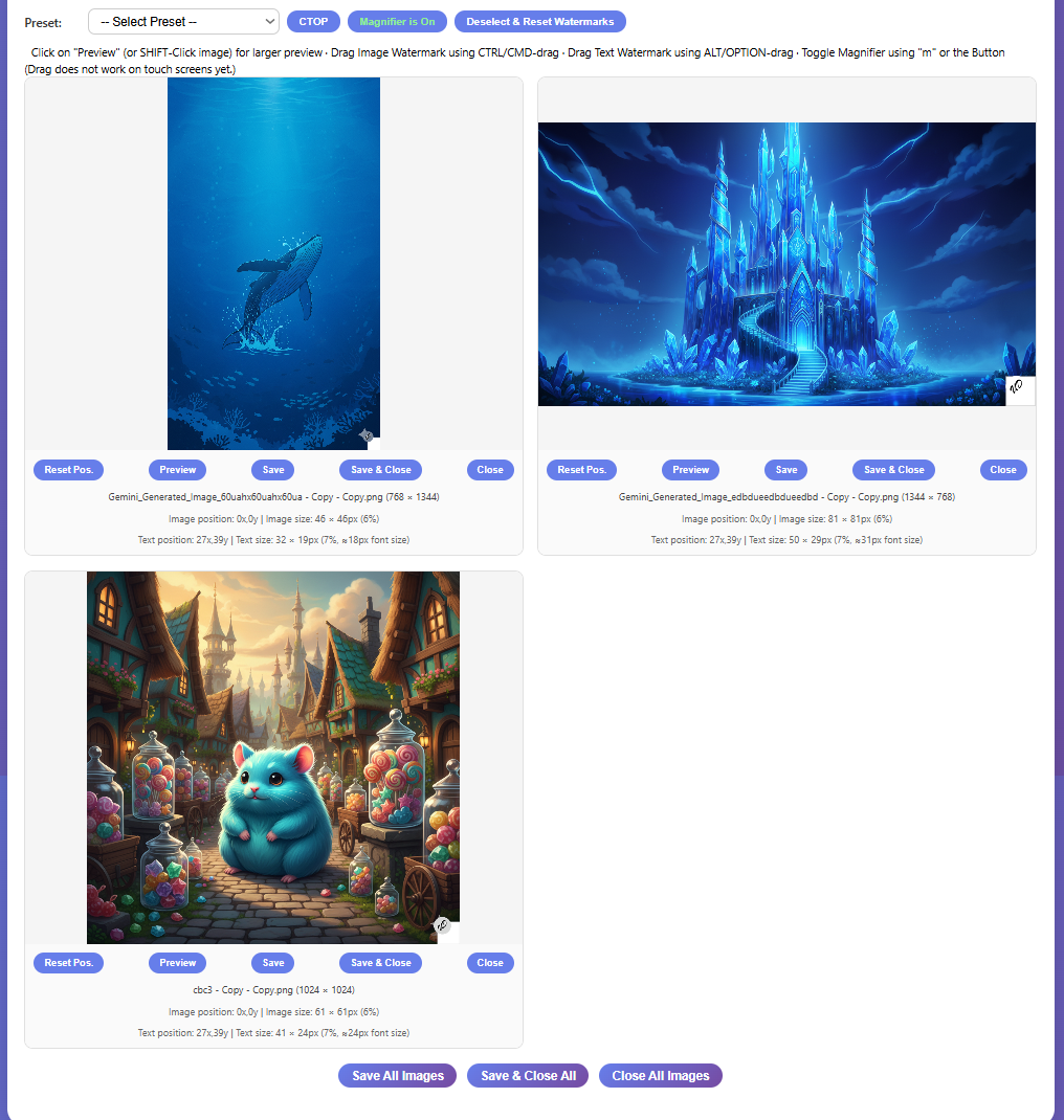
Working With Images
Multiple images loaded (left). Single image closeup (right). Click images for full-size view.
Loading Images
Upload Images — Opens a file picker. Most common image formats are accepted. No practical limit, but images get smaller as more are loaded.
Paste Image — Pastes an image from your clipboard. Pasted images are saved as .png. Especially useful on mobile devices.
Drag & Drop — Drag image files anywhere onto the page and drop them. The entire lower section of the app is a drop zone.
CTRL/CMD-V — Keyboard paste works on desktop.
The Toolbar (Appears After Loading Images)
After your first image is loaded, a toolbar appears with the following controls:
CTOP — Centers the text badge on top of the image badge. Only active when both Text Badge Settings and Image Badge Settings are enabled. Note: if the image badge is too close to the edge, CTOP may not center perfectly to avoid pushing the text off the image.
🔍 Magnifier is On / Off — Toggles the drag magnifier. Also toggled with the keyboard shortcut m. The magnifier shows a zoomed view with crosshairs during drag operations.
🔄 Reset — Turns off both watermark layers, resets the image badge to the white default, and restores all default size, position, color, and opacity settings. It does not unload your text entries or image watermark collection.
💾 Save All Images — Saves all currently loaded images with watermarks applied.
💾❌ Save & Close All — Saves and closes all images. A confirmation dialog will warn you that canceling the save will still unload all images.
Close All Images — Closes all images without saving. A dialog will warn you.
Save Format: PNG or JPG
In the toolbar, next to the Save All buttons, you will find a PNG / JPG toggle that controls the format used when saving images. This setting applies to every save operation in the app — individual Save, Save & Close, Save All Images, and Save & Close All.
PNG (default) — Lossless format. Best quality, larger file size. The saved file keeps its original extension.
JPG — Compressed format. Smaller file size, with some quality reduction depending on the quality setting. When JPG is selected, all saved files are given a .jpg extension regardless of the original file format.
JPG Quality Slider
When JPG is selected, a quality slider appears next to the format toggle.
The slider ranges from 50% to 99%, with a default of 85%.
Higher values mean better image quality but larger files. Lower values produce smaller files with more visible compression artifacts.
85% is a good starting point for most watermarked photos.
The quality slider is inactive and hidden when PNG is selected.
The Bridge Controls
The Bridge is a way to send your watermarked images directly to the UD Collage app without saving them to your device first. Bridge controls appear in the toolbar and in the floating controls panel.
☑ All / ☐ All — Selects or deselects all images for transfer to the collage app. When all images are selected, the button switches to ☐ All (red) to let you deselect all.
Each image card also has a checkbox in its upper-left corner so you can select individual images for the bridge.
📋 Send (N) — Sends the selected images (count shown in parentheses) to the bridge. If the bridge already contains images, a dialog will appear with three choices:
Add to Existing — Adds your selected images to whatever is already in the bridge.
Replace All — Clears the bridge and replaces its contents with your selected images.
Cancel — Does nothing.
🗑️ Empty (N) — Clears all images from the bridge. The count in parentheses shows how many images are currently stored there. A confirmation dialog will appear before clearing.
The bridge uses your browser's local storage (IndexedDB). The collage app must be opened in the same browser to access bridge images. If you are using iOS Safari, both apps must be opened as regular browser tabs from the same domain—not as home screen shortcuts, as those have isolated storage.
The Bridge controls appear in multiple places: the main toolbar area (both above and below the image grid) and in the floating controls panel. They all do the same thing.
The Info (i) Button
A small i button in the toolbar shows a quick-reference tooltip covering drag shortcuts, the magnifier toggle, and touch screen tips.
Buttons Below Each Image
Undo Drag
Clears any manual drag position for that image, returning both watermarks to the positions set by their respective Position dropdowns.
This is per-image — it only affects the image it belongs to.
Copy
Copies the watermarked image to your clipboard (as PNG).
Works on both desktop and mobile (subject to browser clipboard permission support).
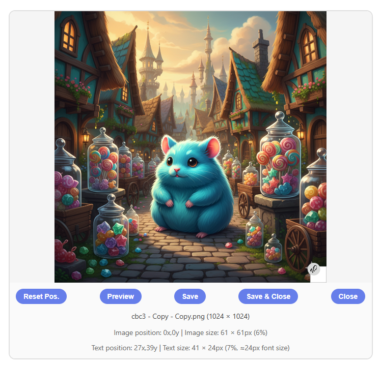
Preview
Opens a full-size preview of the watermarked image.
On desktop, clicking the image directly also opens the preview.
On some mobile devices, previewing an image is the only way to save it to your photo library.
Click anywhere outside the preview, or click the X, to close it.
Save
Saves the watermarked image to your device using the current format (PNG or JPG) set in the toolbar.
On some mobile devices, this saves to Files rather than the photo library.
Save & Close
Saves (using the current PNG/JPG format setting) and closes the image.
🚨 A dialog will warn you that if you proceed and then cancel the save, the image will still be unloaded.
Close
Closes the image without saving. A dialog will warn you.
Information Below Each Image
Filename and dimensions — For example: myimage.png (1024 × 768)
Image badge position and size — Position in pixels from the nearest corner, and actual pixel size with percentage. Example: Image: Bottom-Right (17x,24y) | Size: 82 × 82px (8%). Shows a dash if the image badge is off.
Text badge position and size — Position in pixels from the nearest corner, actual pixel dimensions, size percentage, and approximate font size. Example: Text: Bottom-Right (17x,34y) | Size: 57 × 33px (11%, ≈37px font size), 1px shadow. Shows a dash if the text badge is off.
What A Drag – Dragging Watermarks Around
Text watermark during drag. Image watermark during drag. Textless watermark. Click images for full-size view.
Dragged positions are per-image — dragging a watermark on one image does not affect the others.
Dragging a Text Watermark
Hover over the text watermark on an image, hold ALT/OPTION, and click and drag with the left mouse button.
On touch screens, use a single finger to drag text watermarks.
During drag, the magnifier shows a zoomed view with crosshairs for precise placement.
Toggle the magnifier with m or the Magnifier button in the toolbar.
Dragging an Image Watermark
Hover over the image watermark on an image, hold CTRL/CMD, and click and drag with the left mouse button.
On touch screens, use two fingers to drag image watermarks.
Toggle the magnifier with m or the Magnifier button in the toolbar.
Dragging on Touch Devices
Touching inside an image with one finger moves the text watermark to that spot. To scroll the page, touch outside an image.
Do not press and hold on an image—this activates the device's own magnifier. Just tap and drag quickly.
You cannot turn off the magnifier on touch devices.
Resetting Dragged Positions
The Undo Drag button below each image clears any manually dragged position for that image, returning watermarks to the positions shown in the Position dropdowns.
Dragging Tricks
If a watermark layer is turned off, initiating a drag for that layer will still bring up the magnifier—useful for getting a closer look at the other watermark.
You do not need to hold down CTRL/CMD or ALT/OPTION once the drag has started.
Tips and Workflow Notes
Hold down the +/− buttons to increase or decrease values continuously without repeated clicking.
With both fixed settings sections collapsed and only the floating panel visible, you have a very clean workspace. You can run almost everything from the floating panel alone.
If you want different watermarks for multiple images, watermark the first image, save and close it, then adjust settings for the next one.
Experiment with Auto Color modes. Dragging a watermark across areas with different brightness will show you the auto color system in action.
Drop shadow opacity follows text opacity. Drop shadow width scales slightly with text size.
There are times using all three auto color settings that the drop shadow may seem invisible because it blends with the background. Toggle DS off, then back on, or briefly set a manual shadow color to confirm it is working.
When saving multiple images for web use, switching to JPG at 85% quality is a quick way to reduce file sizes without a noticeable quality hit.
On iOS Safari, if the Bridge doesn't seem to be passing images to the collage app, make sure both apps are open as regular browser tabs from the same address—not as home screen shortcuts.
My typical setup: both fixed sections collapsed, Image Badge off, floating Text Settings panel positioned where I need it. Click image for full-size view.
Developed primarily as a PC web app. Works fine on my iPhone. Let me know if it looks like crap on your device.