UD Collage©
85
UD Collage©
85
🤔
How To...
Create A Border For The Collage
1) Select an image or a shape for Use As Background
2) Select your Use As Background object and change its border setting to whatever you want.
Use An Image As a Background
1) Select or load the image you want to use as a background. You can do this with other objects in the frame.
2) Click Use As Background. This does several things: a) flags the image as a Use As Background object. Use As Background objects have a dashed border around the "pip" in the upper left next to the upper left corner drag handle; b) expands the image to the size of the frame; c) sends the image to the back; d) excludes the image from the layout functions Fit 1, Fit Tiled, Fit by Rows, & Fit by Columns; e) locks the image from resize or delete - you can unlock it with the Lock button.
An image tagged as a Use As Background object resizes with the frame. In all other respects, a Use As Background object can be styled just like a regular image, and acts like a regular image in regards to Frame Lock and Frame Block. This means that if you make the frame wider, the Use As Background object will widen with it, but if you have Frame Blocked, you cannot make the frame smaller until you unblock it.
To restore an image to a regular image, click it and select Restore Image. The image will return to its regular state. BTW, there is nothing to stop you from having more than one Use As Background image if you want to stack them and then use styling for cool effects.
Use A Shape As a Background
Everything about using a shape as the background is almost identical to using an image.
Create your shape and click on Use As Background. To restore it, click on Restore Shape.
Adding Outer Gutters To Auto-Size
Keep Outer Gutters - When checked, Auto-Size will add the width of the Gutters to the size of the canvas.
🎨
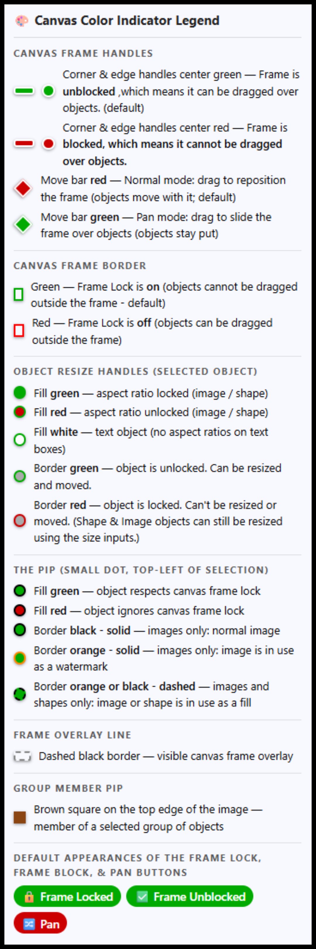
🎨 Canvas Color Indicator Legend
Canvas Frame Handles
Corner & edge handles center green — Frame is unblocked ,which means it can be dragged over objects. (default)
Corner & edge handles center red — Frame is blocked, which means it cannot be dragged over objects.
Move bar red — Normal mode: drag to reposition the frame (objects move with it; default)
Move bar green — Pan mode: drag to slide the frame over objects (objects stay put)
Canvas Frame Border
Green — Frame Lock is on (objects cannot be dragged outside the frame - default)
Red — Frame Lock is off (objects can be dragged outside the frame)
Object Resize Handles (selected object)
Fill green — aspect ratio locked (image / shape)
Fill red — aspect ratio unlocked (image / shape)
Fill white — text object (no aspect ratios on text boxes)
Border green — object is unlocked. Can be resized and moved.
Border red — object is locked. Can't be resized or moved. (Shape & Image objects can still be resized using the size inputs.)
The Pip (small dot, top-left of selection)
Fill green — object respects canvas frame lock
Fill red — object ignores canvas frame lock
Border black - solid — images only: normal image
Border orange - solid — images only: image is in use as a watermark
Border orange or black - dashed — images and shapes only: image or shape is in use as a fill
Frame Overlay Line
Dashed black border — visible canvas frame overlay
Group Member Pips
Brown square on the top edge of the image — member of a selected group of objects
Light brown square on the top edge of the image — solo member of a selected group of objects, meaning no others have been selected yet, or all the others have been deselected. Toolbar unavailable for only one group object.
Default appearances of the Frame Lock, Frame Block, & Pan Buttons
🔒 Frame Locked
✅ Frame Unblocked
🔀 Pan
k
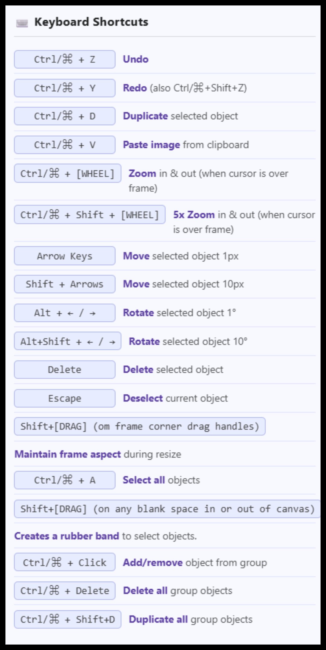
⌨️ Keyboard Shortcuts
Ctrl/⌘ + Z
Undo
Ctrl/⌘ + Y
Redo (also Ctrl/⌘+Shift+Z)
Ctrl/⌘ + D
Duplicate selected object
Ctrl/⌘ + V
Paste image from clipboard
Ctrl/⌘ + [WHEEL]
Zoom in & out (when cursor is over frame)
Ctrl/⌘ + Shift + [WHEEL]
5x Zoom in & out (when cursor is over frame)
Arrow Keys
Move selected object 1px
Shift + Arrows
Move selected object 10px
Alt + ← / →
Rotate selected object 1°
Alt+Shift + ← / →
Rotate selected object 10°
Delete
Delete selected object
Escape
Deselect current object
Shift+[DRAG] (om frame corner drag handles)
Maintain frame aspect during resize
Ctrl/⌘ + A
Select all objects
Shift+[DRAG] (on any blank space in or out of canvas)
Creates a rubber band to select objects.
Ctrl/⌘ + Click
Add/remove object from group
Ctrl/⌘ + Delete
Delete all group objects
Ctrl/⌘ + Shift+D
Duplicate all group objects
!
Overall App Tips
About UD Collage©️ 2025 - fergusonrecipes.com
UD Collage is a web based collage app designed to help you create simple image collages. You can use images, text, or simple shapes to create your collage. This was made mostly to work on PCs and larger screen sizes. It does work on smaller screen sizes, mobile, and touch devices with limited success and a lot of challenges.
This is a work in progress, so if you find bugs or things you think could be done better, let me know. I will fix the bugs, and possibly consider your suggestions. 😂😂😂(See comment below about things we will or can't do.)
* All data and images remain in your browser.
* No sign-in or registration required.
Things we cannot do or do not want to bother with: other shapes, a more robust text editing system, and almost every other feature you can think of. But please suggest because I am bound to miss one or two.
Button Colors
In general, there are three button colors: Blue buttons do something, open something, etc.; Green & Red buttons toggle something on or off. Green indicates that it is in the default state, meaning it is ON; Red means whatever it controls has been turned off. NOTE: the default state of the Frame Blocking feature is "Unblocked", so it is green in unblocked state and red when blocked.
Labels as Reset Buttons
Throughout the controls, most labels next to numeric inputs are clickable reset buttons — clicking the label returns that field to its default value. For example, clicking the Blur: label resets blur to its default, clicking X: resets the X offset, and so on. When in doubt, hover over the label — if it changes color, it is clickable.
For example, clicking the Blur: label resets blur to its default, clicking X: resets the X offset, and so on. When in doubt, hover over the label — if it changes color, it is clickable.
One difference - the Inner: and Outer: buttons in for the gutters are split. Inn and Out set their inputs to 0. The er: set their inputs to 16 and 32, respetively.
Hover Over Any Object on the Canvas for Details
Hover your mouse over any image on the canvas to see a details popup — display size, original size, output (export) size, position, and more. Handy for checking exact dimensions before you save.
Button & Control Tooltips on Hover
Hover over any button or control and wait a moment — nearly everything has a tooltip explaining what it does. The ! button at the end of each toolbar row opens a fuller set of tips for that row. The k button on the first row shows you keyboard shortcuts. The 🤔 button on the top row gives you a few How-To tips. The 🎨button on the top row shows you the color codes on the frame and objects.
Display Size vs. Output Size
Everything on the canvas is shown at display size — but the exported image is always 3× larger. A canvas that looks 1024 × 768 on screen saves as 3072 × 2304. The actual output dimensions are always shown live in the Canvas row next to the W and H inputs.
!
🎨 Main Collage Row Tips
👁️ Preview, 📋 Copy, 💾 Save, 🖨️ Print, & 💥 NEW
👁️ Preview opens a window that lets you see exactly what your collage will look like when Copied or Saved. This is useful when sometimes the display renders slightly different than the final product will. PRO TIP: The display canvas you are working on doesn't show a 100% perfect representation of the final result. Preview! Preview! PREVIEW!
💾 Save allows you to save your collage as either PNG or JPG. If you choose to save the collage as a JPG file, you can choose the quality level. The higher the number, the better quality but the larger the file size.
📋 Copy copies the collage image to the clipboard as a PNG file.
🖨️ Print sends your collage to an attached printer.
💥NEW clears out the current collage and resets everything to the default settings.
📂 Load & 💿 Save Projects
Saving a project saves everything about it, including all of the images, so you can work on it later. The file size is HUGE! I would use this sparingly if you are limited for space.
🖼️ Assets
Browse and load images from the online library. These behave like regular images once added to the canvas. This opens a picker to choose images that you can use as backgrounds and clipart from a directory I created. A work in progress. These are images like any other images added to UD Collage. A curated - hahaha - collection of things I think make great backgrounds.
The Bridge
The Bridge is a specialized way of copying images from one of my other apps, UD Image Sign & Watermark. If you have this app, and have sent images from it to the Bridge, click on the Check button. The Load button will then show you the number of images in the bridge. You can also Empty the bridge. NOTE: Bridge images are stored in your browser's cache. NOTE2: The Load button does not dynamically change, so if you go back to UDWM and add images to the bridge, you will need to click on Check to update the Load button.
r
⭕️ Radius
The 6 Options (dropdown)
Radius gives you 6 corner shape options: Round, Squircle, Bevel, Notch, Scoop, & Square. The Radius slider controls the size of the effect for all shapes except Square.
Browser Warning: As of this writing, only Chromium-based browsers--Chrome, Opera, Edge, etc.--will show the results on the working canvas; the other browsers like Safari and Firefox just show a rounded corner for everything. HOWEVER, because the actual exported collage uses a different process to create the corner shapes, they will appear correctly in Preview, Save, and Copy. Eventually all browsers will support this new CSS standard.
Radius Input (0% - 50%)
Controls how much impact the corner shape has. On smaller objects, the higher number may result in it looking weird or disappearing completely.
Round
Standard circular arc corners. The Radius input controls how large the curve is — at low values you get a subtle softened corner; at high values the shape approaches a pill or circle. This is the default shape.
Squircle
A superellipse-style corner where the straight edge holds longer before curving, then rounds off more abruptly than a standard circle. The result looks more "squarish" than Round but remains smooth — like the rounded rectangle shapes used in modern app icons.
Bevel
Replaces each corner with a straight diagonal cut, producing a flat-edged octagon effect — like clipping the corners off with scissors at a 45° angle. The Radius slider controls how large the cut is.
Notch
Removes each corner with a sharp right-angle rectangular step cut — like a square notch taken out of each corner. The Radius slider controls the depth and width of the notch.
Scoop
The inverse of Round — each corner curves inward with a concave quarter-ellipse, as if a scoop has been taken out of it. The Radius slider controls how deep and wide the scoop is.
Square
No corner shaping — produces a plain rectangle regardless of the Radius value. Use this to remove all corner effects and return the object to a standard sharp-cornered box.
!
🖼️ Some Image Drop Shadow Tips
Place a drop shadow on the image that is X=0 , Y=15, Blur=30. Then create a shape the same dimensions as the image, and place it behind the image. Give it a drop shadow of X=0, Y=5, Blur=10. I sometimes make this shape transparent, give it a black 1px border, and offset it down and right by 1px.
!
🖼️ Image Controls Row 1 Tips
🔓 (The Lock)
Locks the selected image object so it cannot be moved or resized. (Image objects can still be resized using the panel inputs.). When an object is locked, the border around the drag handles is red. When it is unlocked, the border is green.
Border
Allows you to change the width and color of the border. The most important thing to know about adding a border is that borders grow from the edges inward, so it will block out anything on the edges of your images based on the border width.
⭕Radius
See special 'i' button for more on Radius & Corner Shapes
Rot.°
Great for rotating your images. NOTE: Due to a quirk in the system, drag arrows may point in the wrong direction on a rotated object.
Opacity
Opacity allows you to make the entire image the same opacity or create a gradient opacity.
To make the whole image the same opacity, leave the 🔒 between the two opacity levels locked. They will change together.
For a gradient opacity, unlock the 🔒and set the two opacity levels differently. Different start and stop numbers create a radial opacity from the center (Start is higher) to the edge (End is lower) or from the edge (End is higher) to the center (Start is lower).
Drop Shdw
You can turn the drop shadow on or off. You can select the color of the drop shadow. Blur controls how soft and spread the shadow edges are — higher values create a softer, more diffuse shadow. The X and Y figures control the depth of the shadow. Positive is down and right; negative is up and left. NOTE: Always look at the drop shadow in Preview to make sure it is what you want.
!
🖼️ Image Control Row 2 Tips
Image Watermarks
💧 Use as Watermark: This takes the selected image, reduces it to a very small image (width is calculated at 8% of the canvas width) and places it in the lower right corner. It is moved to the top if it is not already on top. The system flags it as a watermark and turns the border on the pip in the upper left corner to orange. Watermarks are not included in Tile, Flexes, or Fit functions.
↩️ Restore: Removes an image as a watermark and enlarges it to either 1/2 of the image's original dimensions or to fit the frame, whichever is smaller.
My Watermarks: Loads the manager for the image watermarks that allows you to use loaded watermarks and create new ones. This has its own guides and tips section.
Use As Background/Restore Image
Use As Background takes the selected image and stretches, crunches, does whatever it needs to do to make it fill the entire frame. It also sends the image to the back. And it marks the image as a Use As Background image so that it is not included in the image count, meaning it will not be included in any Fit 1, Fit Tiled, Fit by Rows, or Fit by Columns functions. Clicking Restore Image restores the image (although not necessarily to the exact same size) and brings it back to the front, and unflags it as a Use As Background object. NOTE: When an image is set as a Use As Background image, the border around the pip in the upper left corner will be dashed; kind of hard to see. NOTE 2: In theory, an image can be both a Use As Background image and a Watermark image (see below), in which case, the dashed border would be orange. NOTE 3: One quirk is that when the Frame is Blocked (red), it cannot be made smaller because it sees the Use As Background object as a blocking object.
↔️ Flip/↕️ Flip
Yeah! You got this!
🔒 Obey Frame
When Obey Frame is green, you cannot drag or resize the image outside the frame boundary unless the global frame is unlocked. The center of the upper left pip will be green. When Obey Frame is red, you can drag and resize the image outside the frame; the upper left pip will have a red center when an object has Obey Frame off.
⧉ Duplicate
Duplicates the selected image, places it slightly offset. All aspects of the image are duplicated, except its Lock state.
❌ Delete
I will let you guess what this does. Can be undone.
🔒 Aspect Locked/Unlocked & ↩️ Reset Aspect
The default state of images is to have the aspect ratio locked. When this happens, the side drag handles are disabled. In locked state, the button is green and the middles of the drag handles are green. When the aspect is unlocked, the button and the drag handles turn red, and the side drag handles are enabled. When you reset aspect, the image is returned to original aspect ratio based on its current width. NOTE: When you reset aspect, aspect is locked again.
Image Size Inputs
Shows you the size of the selected image and allows you to manually change its size. When Aspect is Locked, when one number is changed the other changes also to maintain aspect ratio.
Reset Buttons
For many of the numeric entries, the labels double as reset buttons. In Images, these include Border Width; Radius; Rot.; Drop-Shadow Blur, X, & Y; Opacity Start and End.
!
🔤Text Panel Tips
🔓 (The Lock)
Locks the selected text object so it cannot be moved or resized. When an object is locked, the borders around the drag handles are red. When unlocked, the borders are green.
✏️ Edit
Opens the text editor for the selected text box so you can change what it says. You can also use the ✏️ icon on a text box, or double-click any text box on the canvas to open the editor directly.
Bold & Italic
Toggle bold and italic formatting on the text in the selected text box. When a style is active, the button appears red. NOTE: Not all fonts support bold or italic, so results may vary depending on the font you have chosen.
Size, Color & Font
Size sets the font size for the text. Color sets the fill color of the text characters. Font selects from the available built-in typefaces.
⬅↔➡ Just.
The three justify buttons set the horizontal alignment of text within the text box: left, center, or right. This is independent of where the text box itself is positioned on the canvas.
Shadow (Text Characters)
This shadow is applied directly to the text characters, not the text box. Toggle it on or off, pick a color, and adjust Blur, X, and Y offsets. Positive X and Y values cast the shadow down and to the right; negative values go up and to the left. NOTE: This is separate from the Drop Shdw control in the Text Box row below, which applies a shadow to the whole text box.
Outline
Adds a colored stroke (outline) around the text characters. Toggle it on or off, pick a color, and set the width. Small values like 1 or 2 give a subtle outline; larger values like 5 or more make a bold graphic effect. NOTE: Very large outline widths can start to look unusual depending on the font.
Text Presets
Opens the Text Presets manager. You can save the current text box's formatting as a preset, apply saved presets to the selected text box, and import or export preset collections. If a text box is selected when you click Text Presets, you will be offered the option to save it as a new preset.
!
🔤 Text Box Panel Tips
🔒 Obey Frame
When Obey Frame is green, you cannot drag or resize the text box outside the frame boundary unless the global frame is unlocked. The center of the upper left pip will be green. When Obey Frame is red, you can drag and resize the text box outside the frame; the upper left pip will have a red center.
Drop Shdw (Text Box)
This shadow is applied to the entire text box, not just the text characters. Toggle it on or off, pick a color, and set Blur, X, and Y. Positive X and Y cast the shadow down and to the right; negative values go up and to the left. NOTE: This is separate from the Shadow control in the Text row above, which applies only to the text characters. Always check the result in Preview before exporting.
Background
Toggle the text box background on or off and set its color. When the background is off, the text box is transparent, so only the text characters (and any shadow or outline) are visible. This is useful when you want text to float over an image without a box behind it.
Border
Adds a border around the text box. Set the color and width. Like image borders, the text box border grows inward, so a thick border will eat into the area available for text. NOTE: A border width of 0 means no border.
Rot.°
Rotates the entire text box. Great for angled captions and creative layouts. NOTE: Due to a quirk in the system, the drag handles may point in the wrong direction on a rotated text box. You can use the Size controls in the Shared Controls row to resize a rotated text box accurately.
Opacity %
Controls the overall transparency of the text box. This affects the text characters, the background, and the border all together. 100 is fully opaque; 0 is invisible.
Duplicate
Duplicate the selected text box including the text within it, and places it slightly offset. All properties are copied except the Lock state. Can be undone.
Delete
Delete removes the selected text box and the text within it. Can be undone.
Reset Buttons
For many of the numeric entries, the labels double as reset buttons. In Text, these include Size; Text Shadow Blur, X, & Y; Outline Width; Drop-Shadow Blur, X, & Y; Border; Rot.; Opacity.
r
⭕️ Radius
The 6 Options (dropdown)
Radius gives you 6 corner shape options: Round, Squircle, Bevel, Notch, Scoop, & Square. The Radius slider controls the size of the effect for all shapes except Square.
Browser Warning: As of this writing, only Chromium-based browsers--Chrome, Opera, Edge, etc.--will show the results on the working canvas; the other browsers like Safari and Firefox just show a rounded corner for everything. HOWEVER, because the actual exported collage uses a different process to create the corner shapes, they will appear correctly in Preview, Save, and Copy. Eventually all browsers will support this new CSS standard.
Radius Input (0% - 50%)
Controls how much impact the corner shape has. On smaller objects, the higher number may result in it looking weird or disappearing completely.
Round
Standard circular arc corners. The Radius input controls how large the curve is — at low values you get a subtle softened corner; at high values the shape approaches a pill or circle. This is the default shape.
Squircle
A superellipse-style corner where the straight edge holds longer before curving, then rounds off more abruptly than a standard circle. The result looks more "squarish" than Round but remains smooth — like the rounded rectangle shapes used in modern app icons.
Bevel
Replaces each corner with a straight diagonal cut, producing a flat-edged octagon effect — like clipping the corners off with scissors at a 45° angle. The Radius slider controls how large the cut is.
Notch
Removes each corner with a sharp right-angle rectangular step cut — like a square notch taken out of each corner. The Radius slider controls the depth and width of the notch.
Scoop
The inverse of Round — each corner curves inward with a concave quarter-ellipse, as if a scoop has been taken out of it. The Radius slider controls how deep and wide the scoop is.
Square
No corner shaping — produces a plain rectangle regardless of the Radius value. Use this to remove all corner effects and return the object to a standard sharp-cornered box.
!
📋 Shape Panel Row 1 Tips
Lock
Locks the selected shape object so it cannot be moved or resized. (Shape objects can still be resized using the panel inputs.) When an object is locked, the border around the drag handles is red.
Border
Set the border color and width. Like images, borders grow inward from the edge of the shape. A width of 0 means no border. NOTE: When the background is transparent and the border is 0, the shape is effectively invisible — but it is still there on the canvas and can still cast a shadow if one is set.
⭕ Radius
Rounds the corners of the shape. The value is a percentage of the shortest side. A radius of 50 on a square makes a perfect circle, and on a rectangle makes an oval. Values between 10 and 30 give you nicely rounded rectangles.
Rot.°
Rotates the shape. Combine with a transparent background to create interesting angled border effects. NOTE: Due to a quirk in the system, drag handles may point in the wrong direction on a rotated shape.
Opacity %
Controls the overall transparency of the shape, including its background, border, and any gradient. 100 is fully opaque; 0 is invisible. NOTE: Lowering opacity is a great way to create semi-transparent color overlay effects on top of your images.
Drop Shdw
Adds a drop shadow to the shape. Toggle it on or off, pick a color, and adjust Blur, X, and Y offsets. Positive X and Y values cast the shadow down and to the right; negative values go up and to the left. NOTE: Always check the result in Preview before exporting to make sure it looks the way you want.
Size (W & H)
Set the exact width and height of the shape in display pixels. Useful when you need precisely sized shapes. Remember, the exported size will be 3× these values. NOTE: If Aspect Locked is on (see Row 2), changing one dimension will change the other proportionally.
!
📋 Shape Panel Row 2 Tips
Background
Set the fill color of the shape and toggle between Opaque (solid fill) and transparent (no fill). When transparent, only the border and any shadow are visible, which is great for creating outline-only shapes or using a shape as an overlay frame.
Gradient
Toggle between a Solid background color and a two-color Gradient. When Gradient is active, you can set a second color and choose between Linear (straight across) or Radial (radiating from the center) gradient types. For Linear gradients, the Angle° control sets the direction of the blend.
Aspect Locked / Unlocked
Unlike images, shapes default to having the aspect ratio unlocked (button is red), meaning you can freely resize width and height independently. When locked (button is green), the side drag handles are disabled and the shape resizes proportionally. You can also tell the state by the color of the midpoints of the drag handles.
Obey Frame
When Obey Frame is green, you cannot drag or resize the shape outside the frame boundary unless the global frame is unlocked. The center of the upper left pip will be green. When Obey Frame is red, you can drag and resize the shape outside the frame; the upper left pip will have a red center.
Duplicate
Duplicates the selected shape and places it slightly offset. All properties are copied except the Lock state. Can be undone.
Delete
Delete removes the selected shape. Can be undone.
⬜ Use As Background/⬜ Restore Shape
Saves the current state of the selected shape, then adjusts the shape to exactly fill the canvas dimensions and sends it to the back. Useful for a full-canvas background. The Pip in the upper left corner will have a dashed border (hard to see) when a shape object is set as a Use As Background object. This is handy for creating a full-canvas colored or gradient background in one click.
PRO TIP: Set the border to 0 and the background to transparent after fitting, and the shape becomes an invisible object that still exposes snap targets at the frame edges and center. This gives you precise alignment guides without any visual clutter.
Reset Buttons
For many of the numeric entries, the labels double as reset buttons. In Shapes, these include Linear Gradient Angle; Border; Radius; Rot.; Opacity; Drop-Shadow Blur, X, & Y.
!
📋 Shared Control Tips
Undo/Redo
Stores 50 undo steps. When you get past 50, the oldest one is removed.
All Lock/Unlock
Sometimes you may want to lock or unlock all objects. Locking them means that they cannot be moved or resized. (Image & Shape objects can still be resized using the panel inputs.)
All Aspect Lock/Unlock
The All Aspect Lock button locks and unlocks the aspect ratios of Image and Shape objects. (Text objects do not have changeable aspect ratios.)
Order
You can change the "stacking" order of objects using these buttons.
Align
This is the alignment of the selected object within the canvas. You can choose 🎯 Center, ↔ Centered Horizontally, ↕ Centered Vertically, ⬆ Align Top, ⬇ Align Bottom, ⬅ Align Left, ➡ Align Right.
To align objects with each other, use the Object Snap guidelines.
Finding Buried Objects
Sometimes you may have objects buried under other ones. Clicking on any of the Find Hidden buttons will cycle through all of the objects of the selected type, selecting them and flashing a dashed border around their location. You can then use the Order buttons to bring the found object to the front, or use other buttons as you would any visible object.
In Group 0
!
Group
Overview
The Group Controls will become enabled any time 2 or more objects are added to the group. Objects can be added by Ctrl/Cmd+A (select-all) or by Ctrl/Cmd+click. On PCs they can also be added with Shift+Click+Drag a rubber band around objects you wish to add. Objects can be removed in a number of ways: click either of the "Remove All" buttons or Ctrl+click on each of the group objects until only one is left.
The group objects will have a square brown pip near the middle of the upper edge of the image. The group object with the drag handles is the "boss" object. This is the object you will drag. When using the alignment features, he is the object you are aligning to. Clicking on a different object in the group will make it the new boss. Any object in the group can be the boss just by clicking on it. A boss object can have just about everything done to it that a non-group object can.
Some Tricks.
You Need To Move One Member of the Group - Select the object you want to move, then lock the group using the All (in group) Lock button. Next go up to the controls for the object you have selected and unlock it with its lock button, the little round lock icon, which should be red. It will turn green and you can now move your selected object anywhere without moving the rest of the group. When you have it where you want, unlock the entire group and they will all move together again.
Next Trick -
!
Group Controls Row 1
Select All/In Group [#]/Deselect All
The saddlebrown In Group Icon with the number in it shows the number of items that are part of the Group.
Objects can be added by using the Select All button, Ctrl/Cmd+A (select-all), by Ctrl/Cmd+click. or Shift+Click+Drag, which creates a rubber band around objects you wish to add.
Objects can be removed in a number of ways: click either of the "Deselect All" buttons or Ctrl+click on each of the group objects until only one is left. This only deselects images from the group; it does not delete them.
The group objects will have a square brown pip near the middle of the upper edge of the image. The group object with the drag handles is the "boss" object. This is the object you will drag. When using the alignment features, he is the object you are aligning to. Clicking on a different object in the group-select group will make it the new boss. Any object in the group can be the boss just by clicking on it. A boss object can have just about everything done to it that a non-group object can.
🗑️ Delete Grouped Objects, ⧉ Duplicate Group
🗑️ Delete Grouped Objects - deletes all of the objects in a group. You can also use Ctrl/Cmd+Delete to delete all of the objects in the group.
⧉ Duplicate Group - duplicates all of the objects in a group and adds them to the group. You can also use Ctrl/Cmd+Shift+D to duplicate.
↔ Distribute Horizontally & ↕ Distribute Vertically
Distribute requires 3 or more objects to have been selected. It looks at the first and last object you selected, and then spreads the rest of the objects between them with equal spacing. The first and last objects do not move.
This does not space them using the centers. If for example, you have 500px between the left edge of the first object and the right edge of the last object, and you have two other objects that are 125px and 225px wide, you will have a space of 50px between each of the images.
↔️ Pack H, ↕️ Pack V
↔️ Pack H, ↕️ Pack V packs the objects in the group so that there is no gap between them. It does not adjust their position in the opposite dimension.
Flip All H & Flip All V
Flips each object in the group horizontally or vertically. Does not flip the group, just each individual object. Does not flip text objects.
⬅ Left, ➡ Right, ⬆ Top, ⬇ Bottom, ↔ H.Ctr, ↕ V.Ctr
⬅ Left, ➡ Right, ⬆ Top, ⬇ Bottom, ↔ H.Ctr, ↕ V.Ctr align all of the other selected objects with the boss object.
Quirks
In addition to some of the oddities shared above, there are a couple more to be aware of.
When an object in a group is selected, it become the boss object. You can change all of the characteristics of that object just as if it were not part of a group. For example, any of the Align buttons from the Shared row, will only move the boss object.
Since you can change the characteristics of objects in a group individually, you can do some interesting things. For example, if you lock the entire group from moving, you can then unlock an individual member, reposition it without the other members moving. When you unlock the rest of the group, they will all moved together again.
You can duplicate the boss object by itself, but the duplicate will not be part of the select group.
You can also delete the boss object with the delete key; if a new boss is not automatically selected, clicking on any object in the group will make it the boss.
Until a group modification is made using any of the group controls, group members retain their individual settings. For example, they could all have different drop shadows until you change the group drop shadow settings.
When moving the group of selected objects, individual objects still obey or ignore the frame boundary based on their individual settings.
r
⭕️ Radius
The 6 Options (dropdown)
Radius gives you 6 corner shape options: Round, Squircle, Bevel, Notch, Scoop, & Square. The Radius slider controls the size of the effect for all shapes except Square.
Browser Warning: As of this writing, only Chromium-based browsers--Chrome, Opera, Edge, etc.--will show the results on the working canvas; the other browsers like Safari and Firefox just show a rounded corner for everything. HOWEVER, because the actual exported collage uses a different process to create the corner shapes, they will appear correctly in Preview, Save, and Copy. Eventually all browsers will support this new CSS standard.
Radius Input (0% - 50%)
Controls how much impact the corner shape has. On smaller objects, the higher number may result in it looking weird or disappearing completely.
Round
Standard circular arc corners. The Radius input controls how large the curve is — at low values you get a subtle softened corner; at high values the shape approaches a pill or circle. This is the default shape.
Squircle
A superellipse-style corner where the straight edge holds longer before curving, then rounds off more abruptly than a standard circle. The result looks more "squarish" than Round but remains smooth — like the rounded rectangle shapes used in modern app icons.
Bevel
Replaces each corner with a straight diagonal cut, producing a flat-edged octagon effect — like clipping the corners off with scissors at a 45° angle. The Radius slider controls how large the cut is.
Notch
Removes each corner with a sharp right-angle rectangular step cut — like a square notch taken out of each corner. The Radius slider controls the depth and width of the notch.
Scoop
The inverse of Round — each corner curves inward with a concave quarter-ellipse, as if a scoop has been taken out of it. The Radius slider controls how deep and wide the scoop is.
Square
No corner shaping — produces a plain rectangle regardless of the Radius value. Use this to remove all corner effects and return the object to a standard sharp-cornered box.
!
Group Controls Row 2
The controls in the Group Controls Row 2 apply to each member of the group as individual objects. So if an object is rotated 45° as part of a group, that object remains rotated at 45° when it is removed from the group until you change it.
The Lock & Unlock Buttons
All (In Group) 🔒 Lock & 🔓 Unlock lock or unlock all of the selected objects. When locked, they cannot be moved or resized. (Image & Shape objects can still be resized using the panel inputs.).
Aspect🔒 Lock & 🔓 Unlock lock or unlock the aspect ratios of all of the selected objects. Handy when you have a lot of objects and you want to change the aspect ratio status of some of them at once.
The Obey & Ignore Frame Buttons
Frame 🔒 Obey means that none of the objects in the group can leave the canvas no matter what its state was before being part of the group. 🔓 Ignore means that all objects in the group can be dragged outside the boundary.
⭕ Radius
See the 'r' button for more information.
Drop Shdw
The drop shadow control applies the same drop shadow to all objects in the group. For text, this is the box around the text, not the text itself. This overrides all previous drop shadow settings, and works like the individual drop shadow settings.
Border
Border applies a border of the chosen color and width (px) to all selected objects. The Border label resets the width to 0.
(3072 × 2304)
!
📋 Canvas Row
Auto-Size
Auto-Size finds the smallest size that encompasses all of the objects, taking drop shadows and Outer Gutter Width into consideration. NOTE: If you have Pan on, this button will turn Pan off and lock the frame before performing this function.
Keep Outer Gutter
Keep Outer Gutter - When checked, Auto-Size will add outer gutters to the calculated size of the canvas.
Collage Size
W & H show you the width and height of the display canvas. You can input new figures by entering them or using the Up & Down arrows. Next to them, you will see the actual output dimensions of the collage, in parentheses. These will always be 3 times the dimensions of the display sizes. Default is 1024 x 768 (3072 x 2304).
Next you will see a drop-down menu of the most popular preset sizes.
To the right of the presets are two buttons.
The first is the reset button, which just sets the canvas back to the default size; this does not change the size of the objects.
The second button is the Recenter button. This recenters the canvas in the window without resizing. When this is clicked, the frame is locked and Pan is turned off.
The first is the reset button, which just sets the canvas back to the default size; this does not change the size of the objects.
The second button is the Recenter button. This recenters the canvas in the window without resizing. When this is clicked, the frame is locked and Pan is turned off.
Any time one of the dimensions exceeds 2000px (6000px exported) the numbers will turn red. This is a warning that the resulting file size may be quite high!
Shift-Drag During Resize Maintains Frame Aspect Ratio
If you wish to maintain the aspect ratio of the frame itself when resizing, hold down the SHIFT key while dragging one of the four frame corner handles.
Collage Background
Here you can select the color of the collage background. The checkbox will make the background transparent.
Frame Lock, Frame Block, Pan and Center
By moving the frame borders and by working with Frame Lock, Frame Block, Pan and Center, you can select what parts of your collage appear in the final collage image. Use Preview (top row) to see what the image will look like. Use Crop to Frame (top row) to create a new image which you can add to the collage or use to replace the collage. NOTE: Remember that when you use Crop to Frame and add it as a new layer (image) it may not be immediately obvious. Use the Find Hidden buttons to find it and the Order buttons to bring it to the front. NOTE 2: Frame Lock and Frame Block are turned off when Pan is turned on. These DO NOT reset when Pan is turned off using the Pan button.
Default appearances of the Frame Lock, Frame Block, & Pan Buttons
🔒 Frame Locked
✅ Frame Unblocked
🔀 Pan